Saturday, June 8, 2013

Tinker Tech Radio Shack

This was the last project for Junior year. Working as a team we had to change a company's demographic to something that they aren't advertising to. My team chose Radio Shack as our company and we split it up between kids, hobbyists, and Professionals.
After a week we changed the idea from three different ones to working on only kids and create an area that would spark young people to enjoy working with technology. Our first hurdle was coming up with a logo. At first we were thinking of just using the name RadioShack, but since that wasn't too kid friendly we changed it to TinkerTech.
 After some tries, we were able to come up with a final logo Idea

After coming up with the logo, my team mates and I split apart the project so that we each had different parts. 

I designed a pamphlet using elements from my teammate's design. (He made the robot mascot and the patches) This would be sent to parents, that subscribed to Radio Shack, to tell them about all that their child can do while at Tinker Tech. My teammates and I decided on having different classes that would show the children how to create the project of the month. With this in mind, I designed a box for the kits that the children would get. Each color would symbolize the level of the project.  

After creating a box, I designed a cart that could be moved to each table for easy access. This would have wheels on the bottom to roll on the floor easier. 

Friday, June 7, 2013

Healthy Living

This project was to take a company and rethink who they advertise to. After spending several hours trying to find a company that does healthy cooking, my teacher told me that I can make a company that would put its name on products that fit in that category, basically like Martha Stewart's company does.

My first problem was coming up with a logo design. I wasn't sure of how to go by with the name of the company. I tried using the full name, then the two letters, then I tired to use a shape.


I felt that the letters were stronger than the full name so I started to work on just having the two letters. I also wanted to use a shape around the name to give it a border. I tried several different attempts at making a logo, with different fonts and color schemes. I settled on the Diamond shape of the logo.
After figuring out which logo I wanted I though of "What is Healthy Living going to stand for?" My teacher and i decided upon a Healthy Living for diabetics. With this idea I started working on a website design. 


After designing a website, I wanted people to be able to use this when cooking. I decided to make an Ipad app that people can use while cooking in the kitchen. 
Once the app would open the user can type a category or the name of a dish into the search bar. The app would then pull up what the category was or the recipe. Here I have the category desserts in the search bar. This brings up a list of healthy, diabetic safe desserts that the chef can pick which to make.

After selecting a dessert the app displays the needed ingredients and how to prepare the selected dish.


I also wanted to make some sort of mailer/magazine that would hold food ideas and coupons for certain diabetic safe foods. 


Target Annual Report

This was a project in my sophomore year. We had to re-design an annual report for a company. I decided to work on a Target annual report.


 I tried different attempts at a cover design. Each of which, were either too busy or too simple. I stayed with the last one and modified it. I wanted to stick with what Target has to offer to its customers. The idea of the different departments came to mind such as Grocery, Electronic, Furniture, and Clothing. Using those elements I created a cover design that I enjoyed that still held that Target feel without it being to abstract. 


Part of the project was also to create an inside spread using the theme of the cover. I tried to use the circle theme. 
I didn't enjoy how it fully came out. I felt it was too close, not enough breathe room. After several attempts at changing he way it looks, I was able to make something that had breathing room and still held onto the theme of the cover. 

Thursday, March 21, 2013

Cyberdog Catalog

Cyberdog Catalog Design
Table of Contents

Men's Shirt Spread Design

Men's Pants Spread Design

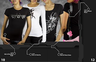
Women's Shirt Spread Design

Echo Rebranding


The current website that the Echo has is not appealing to the eye. I chose to re-design the website so that it has a better look. I held on to the tablecloth pattern the original website had as a background for the navigation buttons. 

Part of the project was to re-create the logo. At first I aimed for a more, icon like logo, utilizing the many different things Echo served. 
After attempting at a new icon logo, I moved away and tried using the letter E. After A few attempts, I got the result...


Final Logo Design. 


                                                 Gift card and certificate re-design.
I designed two different types of business cards that The Echo could hand to others. 


The current uniforms at Echo are a button down shirt and a apron. Both do not have the Store logo on. I designed a simple uniform that workers could wear. 

Butterfly Series

Butterfly show Ad series, ad 1

Butterfly show Ad series, ad 2

Butterfly show Ad series - ad 3

Package Design Projects

Soap box Package Design

Printer Cartridge package Design

Non-Health related bottles - Labels


Non-Health related bottles - Box